As a service provider I know it is always in my own best interest to provide my customers with something that they are able to use easily and without frustration or confusion. While this is never the reason clients come to me and is never the problem they ask me to ultimately solve, I know that the rest is useless if it is built on top of a platform which is beyond the technical capabilities of my client or simply incompatible with their unique style and expectations. If a client cannot use a website that I provide them, what good is it?
Also, from a more selfish perspective, how productive can I be if I have to spend much of my time training and supporting sites which my clients struggle with. Anyone who has been doing this for as long as I have knows that training and support, while important, can seem like an anchor which prohibits growth and the ability to take on new, exciting projects.
For these and other reasons, I believe that admin user experience cannot be underemphasized. Quite often it is an afterthought for WordPress designers and developers who take for granted how simple WordPress is to use. This is a topic I’ve spoken on at many WordCamps and meetups and have also released a number of plugins which help facilitate better admin UX, some of which I’ll mention below.
So here are my top 7 easy ways to improve the admin experience for clients:
1) Simplify the admin menu
The WordPress admin menu consists of all the links to the admin pages a user has access to based on their role. I’ve found that 9 out of 10 times, there are more links present than necessary for my clients to get their work done. Also, apart from there being too many unnecessary links, the links that exist may not be labeled or positioned based on the client’s need and expectations. For example, does every client think of the articles they write on their site as “Posts”? Or do they refer to them as something else?
Consider also whether the arrangement of the links corresponds well with the priorities of the client. The traditional menu order may look like:
- Posts
- Media
- Pages
- Comments
- Custom Post Types
But is this the ideal order for everyone? In many cases, my clients don’t even need Media, Pages are rarely touched and Posts may be secondary to Custom Post Types like Events or Products. And do they even need to have the taxonomies available in the menu?
Let’s consider an alternative:
- Events
- Products
- News
- Main Pages
- Comments
In this example, we moved the most frequently used post types for this imaginary client to the top, renamed Posts to News, changed Pages to Main Pages and removed Media. Simple but a big difference for this client.
All of these changes can be done programmatically or with a variety of plugins. My favorite though, is Client Dash. This is a plugin we developed which offers an awesome, familiar, easy to use interface for modifying the admin menu on a per-role basis. It allows you to change and rearrange to your heart’s content. And it is completely free. Here’s an animated screenshot:

2) Provide some integrated tutorials
There are currently loads of really good options for integrating tutorials within the WordPress dashboard. These can be excellent resources for clients who are unfamiliar with the WordPress interface. It allows them to be trained on the fly without you, the expert, ever being bothered by a phone call.
Here are a few cool options for integrating tutorials that I know of:
I believe this is a really cool way to teach clients how to use WordPress and make them feel more comfortable with the interface.
In addition, it is worth noting that WordPress has an excellent tooltip feature and a reasonably usable API for creating your own, custom tooltips. This is a very nice way to guide customers and first time users to where they need to go and walk them through their necessary workflows.
3) Provide easy access to support
Unless, for some reason, you don’t want your clients to contact you after you’ve turned over their site, I’ve found that offering a simple, contextual way to request assistance or guidance is invaluable to many customers. There are a number of reasons I like this. Most importantly, it is nice for the customer. They can be given a clear way to access you at the very moment of their confusion. It makes them feel like they are not alone. Another reason I like this is because it can help control and manage the requests more effectively. If a client is simply left to choose when and how to contact you, they’ll invariably choose a method which disrupts your work day and is difficult to manage and delegate such as a phone call, text or email. In contrast, tickets or other such inquiries made via their dashboard can be made to integrate with internal systems for managing, assigning and responding to and can also be programmed to provide additional context that clients may forget or not know how to include such as domain, user, IP, active plugins, current screen, time, browser, etc.
Exactly how this is implemented depends on your style and processes. We use our own custom tools but there are some others out there which create ticketing systems within the dashboard or integrate with popular tools like Zendesk.
Here are a few simple suggestions of ways in which one could offer contextual and easy access to support:
- A dashboard widget
- Links in the toolbar
- Links in the admin menu
- Information in the Help dropdown available on some admin screens
- Links in the admin footer
All of these can link to your own support channels or provide direct access to a form or something.
4) Better dashboard widgets
I don’t think many will argue with me about the fact that the default WordPress dashboard widgets are not completely useful or relevant to most clients. The reality is that the current dashboard is an utterly useless interface to the vast majority of my customers. Most of them never go there and have no good reason to. To me, this is a waste. I like the concept of a dashboard that serves as a helpful landing page where users are welcomed into the WordPress admin area and clearly directed to wherever they may need to go.
For this, I again recommend Client Dash. We wanted very much to be able to make the dashboard useful to customers and be able to give each one exactly what they needed and nothing more when they logged in so we created another intuitive and familiar interface for manipulating what is presented there. Here’s another animated screenshot:

5) Live preview of shortcodes
Shortcodes are hard to use. They challenge basic users by requiring them to learn and abide by a syntax and understand the nuances to WordPress shortcodes. One of the greatest improvements to admin user experience we’ve discovered has been providing a UI for inserting and modifying shortcodes and also providing a live preview of them as opposed to simply displaying the ugly [ shortcode ] inline which only perplexes content creators and requires them to preview their posts on the front end to understand what the shortcode is rendering.
Live rendering of the shortcodes is something we’ve invested heavily in and is one of the coolest features of our latest plugin, Render. Features include an advanced yet intuitive interface for inserting shortcodes into content or a sidebar as well as a live preview of the shortcodes result. In effect, someone using the plugin correctly will never see an actual [ shortcode ] which from my perspective is amazing.
Render comes with lots of handy shortcodes baked in, all of which include a live preview for easier usage. In addition, we’ve created a crazy simple API which enables other developers to integrate their shortcodes with our interface and functionality.
6) Embrace custom fields
When it comes to creating and managing content, I’ve found custom meta boxes and fields to be a huge asset. When compared to using the main content editor exclusively, they effectively change one big, hard question into several small, easy questions. The end result is more content gets produced. Every time. Also, the consistency in formatting that information on the front end is also improved when using a modular approach where pieces of information are separated into different inputs.
I have had many experiences where the productivity of content creators was increased while at the same time support requests were decreased, simply due to the addition of some simply custom fields. Here’s an example from a site I made for a WWII historian who was publishing bios of veterans he had interviewed personally:
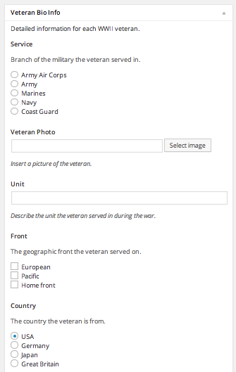
This meta box, though more complex at a glance than simply having the editor, actually greatly simplified the process of publishing new content for this author who was, I might add, not the most technically savvy individual I’ve worked with.
7) Role control
I’ll keep this one simple: Give users only the capabilities that they absolutely need. Arbitrarily making someone an administrator is at the same time lazy, irresponsible, dangerous and poor customer service. How we handle this is generally by giving users a very basic set of capabilities such as those given to an author and then add capabilities as needed. I’ve found that a good practice is to make an assumption of what a user needs to do and giving them just barely the permissions to do that, often leaving out capabilities that seem likely to be necessary. Then, as users request more capabilities we can add them by programmatically adding a capability or creating custom roles.
Conclusion
Admin UX matters and there are plenty of easy ways give clients a pleasant and manageable experience. Did I leave anything out?